
Expandable card
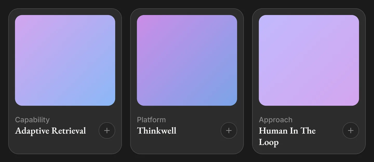
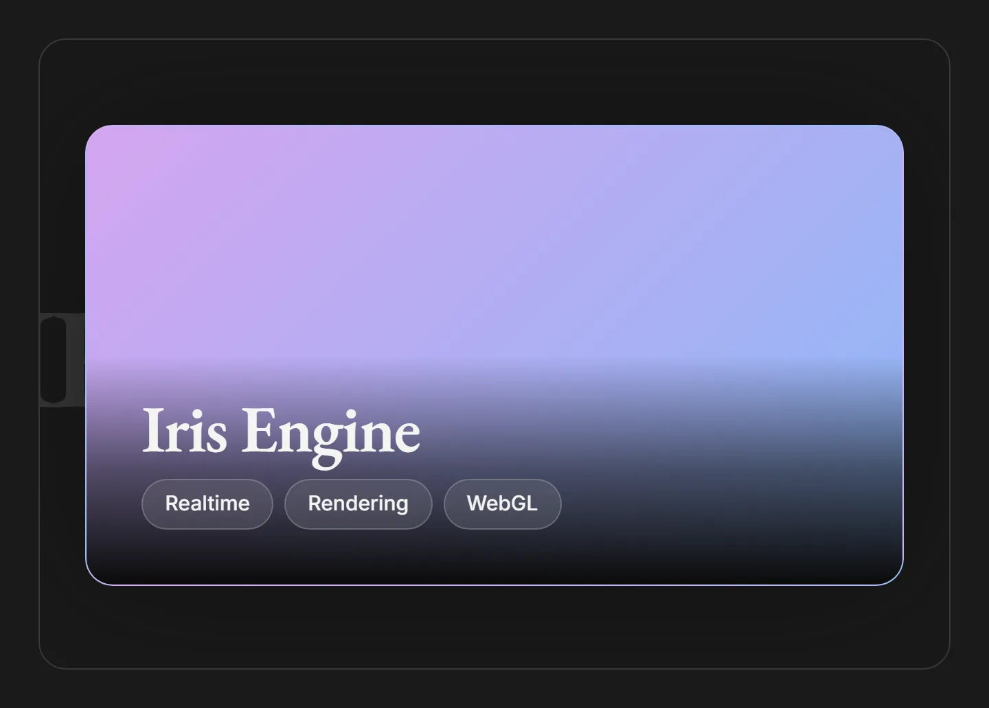
A compact card that morphs into a full modal in a single shared-element transition. Click any card to expand it, then close with the button, the Escape key, or a click outside.
Overview
The expandable card shows a compact tile that grows into a full modal when clicked. The tile, title, description, and toggle button are shared elements: they morph smoothly between the collapsed and expanded states rather than swapping out, so the transition reads as one continuous motion.
Use it for a grid of items where each needs room to tell a longer story on demand: capabilities, case studies, team members, or feature write-ups. The collapsed grid stays scannable; the expanded view carries the detail.
Installation
Import the pattern from loosethreads:
import { ExpandableCard } from "@pulp/loosethreads/patterns"Usage
Give each card a title, a short label, and a gradient for its tile. The expanded body is whatever you pass as children:
import { ExpandableCard } from "@pulp/loosethreads/patterns"

function CapabilityCard() {
  return (
    <ExpandableCard
      title="Adaptive Retrieval"
      description="Capability"
      gradient="linear-gradient(135deg, var(--iris-violet), var(--iris-blue))"
    >
      <p>
        Adaptive retrieval pulls the right context at the right moment,
        ranking sources against the live intent of a query.
      </p>
    </ExpandableCard>
  )
}
Props
| Prop | Type | Default | Description |
|---|---|---|---|
title | string | Required | Card heading, shown in both states and used as the accessible dialog label when expanded. |
description | string | Required | Short label above the title (e.g. Capability, Platform). Kept to a word or two. |
gradient | string | Required | Any CSS background value for the tile. Prefer the iris tokens, e.g. linear-gradient(135deg, var(--iris-violet), var(--iris-blue)). |
children | ReactNode | undefined | Body content revealed in the expanded modal. Optional. |
Anatomy
Each card holds a gradient tile, a description label, a title, and a toggle button, all tagged with a shared layoutId so they animate between states. Expanding one renders a fixed, backdrop-blurred modal centered over the page; the plus icon rotates into a close icon.
Inside a clipped or transformed container the fixed modal would be trapped by the nearest transformed ancestor. The component detects that case (the docs demos rail) and instead scales the expanded card to fit its box. On a normal page the standard shared-element modal renders unchanged, so you rarely need to think about it.
Accessibility
- Dialog semantics. The expanded card is a
role="dialog"witharia-modaland is labelled by its title; the toggle button carries an explicit open / close label. - Dismissal. Close with the button, the Escape key, or a click outside the card.
- Motion. The morph is triggered by a click, not on load, so no
prefers-reduced-motiongate is required.
Next: Debug panel. Back to Cards & panels.