Scroll-stack cards
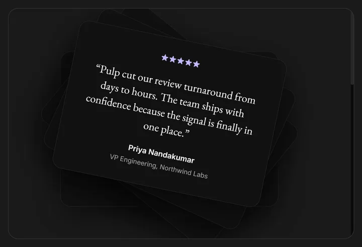
A deck of testimonial cards that stack on top of one another, then peel away one by one as you scroll. Scroll inside the preview to peel through them.
Overview
Scroll stack cards render a deck of cards that sit on top of one another, then peel away one at a time as you scroll. Each card maps its own slice of the scroll progress to a translate and rotate, so the stack thins out card by card until the last one stays centered as the resting state.
The effect is self-contained: ContainerScroll ships its own fixed-height, internally scrollable box with a runway several times taller than the frame. Scroll happens inside that box rather than the page, so the peel completes within the preview instead of hijacking the whole viewport. Scroll inside the frame to peel through the stack.
Installation
Import the pattern from loosethreads:
import {
  ContainerScroll,
  CardsContainer,
  CardTransformed,
  ReviewStars,
} from "@pulp/loosethreads/patterns"
Usage
Compose the three parts: wrap the deck in ContainerScroll, group the cards in CardsContainer (it sets the 3D perspective), and render one CardTransformed per item. Give each card its index and the total arrayLength so it can claim its slice of the scroll:
import {
  ContainerScroll,
  CardsContainer,
  CardTransformed,
  ReviewStars,
} from "@pulp/loosethreads/patterns"

const reviews = [
  { name: "Priya Nandakumar", quote: "Cut our review turnaround from days to hours.", rating: 5 },
  { name: "Marcus Bell", quote: "We replaced three internal tools with one workflow.", rating: 4.5 },
  { name: "Sofia Alvarez", quote: "The stacking view makes it obvious what needs attention.", rating: 5 },
]

function Testimonials() {
  return (
    <ContainerScroll>
      {/* Pins to the top of the scroll box and centers the stack. */}
      <div style={{ position: "sticky", top: 0, display: "flex", alignItems: "center", justifyContent: "center" }}>
        <CardsContainer>
          {reviews.map((review, index) => (
            <CardTransformed key={review.name} index={index} arrayLength={reviews.length}>
              <ReviewStars rating={review.rating} />
              <p>{review.quote}</p>
              <span>{review.name}</span>
            </CardTransformed>
          ))}
        </CardsContainer>
      </div>
    </ContainerScroll>
  )
}
Props
CardTransformed is the peeling card and carries the configurable props. It also accepts any motion.div prop (including style and event handlers).
| Prop | Type | Default | Description |
|---|---|---|---|
index | number | Required | The card's position in the stack, starting at 0 for the top card. Determines which slice of the scroll progress the card peels across and its stacking order. |
arrayLength | number | Required | Total number of cards. Used to size each peel slice; the final card does not peel and stays centered as the resting state. |
incrementY | number | 10 | Vertical offset in pixels between each stacked card. |
incrementZ | number | 10 | Depth step between cards. Scales both the translateZ and the z-index so deeper cards sit further back. |
incrementRotation | number | -index + 90 | Starting rotation in degrees that the card peels from as it leaves the stack. |
children | ReactNode | undefined | Card contents. Typically a rating, a quote, and an attribution line. |
Anatomy
ContainerScroll is the outer framed box: it clips to a rounded border and holds an inner overflow-y: auto scroller plus a tall runway. It reads that box's scroll progress and shares it through context, so every CardTransformed inside animates off the same value. ReviewStars is a small helper that draws a filled, fractional, and empty star row from a rating (and optional maxRating, default 5).
Keep motion on one package. The cards read a MotionValue from motion/react. A value from a different motion package will not render inside these elements, so import motion from a single entry point.
Accessibility
- Labels. Each card is a
role="group"with anaria-label, andReviewStarsrenders a visually hidden "X out of Y stars" label so the rating is announced. - Motion. The peel is bound directly to scroll position, which is user input, so nothing auto-plays. There is no ambient animation to gate behind
prefers-reduced-motion, and the source does not check it.
Next: Perspective scroll showcase. Back to Scroll effects.