

Pulp
  • Company
Access Demo
    • human interfaces
    • critical decisions
    • persona engine
    • machine health
    • data storytelling
    • persuasive intelligence
    • workforce optimization
    • custom ai/ml
    • policy & governance
    • marketing & media
    • consulting & management
    • finance & markets
    • public engagement
    • thinkwell™ workstation
    • thinkwell™ plugin
    • pulp™ api
  • Company
Access Demo

Overview

  • Introduction
  • Getting started

Guides

  • From draft to decision
  • Score a Reddit thread
  • Ground a claim in evidence
  • Simulate an audience
  • AI Debate Tournament

SDKs

  • Server-Side SDK
    • Radiance
      • RootWords
        • Docs
        • Sections
        • Paras
        • Sentences
        • Clauses
        • Claims
        • Phrases
        • Named Entities
        • Words
        • Characters
        • Special Characters
        • Special Patterns
      • RootCause
      • StemReferences
      • AdCanopy
    • Windfall
      • TrueAura
        • Demographics
        • Psychographics
        • Mindstate
        • Environment
        • Memory
        • Vision
      • NectarRewards
      • PoisonIvy
      • GrapeVine
    • Groundwater
      • WebSoil
      • DomainCrust
      • CodeMantle
      • ServerCore
  • Web SDK
    • loosethreads UI/UX
      • WarpDisplays
      • WeftConversations
      • DyeMedia
      • BightInteractions
      • Component Library
        • Sandbox
          • Cards & panels
            • Expandable card
            • Debug panel
          • Text effects
            • Morphing text
            • Video text
          • Device & browser frames
            • Safari frame
            • iPhone frame
            • Android frame
          • Canvas & 3D
            • Crowd canvas
            • Interactive robot
          • Data & visualization
            • Location map
            • Leaderboard
            • Structured Discussion Bracket
          • Controls & inputs
            • Region Selector
          • Scroll effects
            • Scroll-stack cards
            • Perspective scroll showcase
            • Scroll Scrubber
        • Production

Reference

  • References catalogSoon
  • Conventions
  • PricingSoon
  • Status and roadmapSoon
Introduction
Getting started
$pip install pulp-sdk
From draft to decision
Score a Reddit thread
Ground a claim in evidence
Simulate an audience
AI Debate Tournament
Server-Side SDK
Radiance
RootWords
Docs
📄sample.txt2 paras · 160 chars
Sections
§1 Introduction
Paras
¶1: first paragraph block
¶2: second paragraph block
Sentences
S1S2S3S4
Clauses
C1C2C3C4C5C6
Claims
Claim 1Claim 2Claim 3
Phrases
NPVPNPVPPPNP
Named Entities
Pulp [ORG]
Words
ifwewaitforcertaintywewillbe+20 more
Characters
0 → 159
Special Characters
spaces × 27punct × 8nbsp × 0
Special Patterns
0 patterns detected
RootCause
Ethos
—
Pathos
—
Logos
—
Kairos
—
Style
—
Clarity
—
Focus
—
Awareness
—
Persuasive Velocity—
StemReferences
CensusFECCongressFed. Reg.RegulationsLegiScanGovInfoGDELTCivicWikimediaData.govPodcast Idx
AdCanopy
rank
Windfall
TrueAura
Demographics
life_stageyoung_adult
education_levelbachelors
locationurban
occupationtech
Psychographics
Impelling
Compelling
Repelling
Mindstate
alpha 10 Hzcalm
Environment
vision onhearing onsmell offtouch offtaste off
Memory
purchases 12content 48brands 5
Vision
motivationdesirefear
NectarRewards
define
PoisonIvy
apply
GrapeVine
post
Groundwater
WebSoil
heatmap
DomainCrust
price
CodeMantle
trace
ServerCore
uptimeresize
Web SDK
loosethreads UI/UX
WarpDisplays
📄q3-report.pdf
🖼chart.png
▶keynote.mp4
WeftConversations
ThreadsChatInlineSide panels
DyeMedia
TextToday
ImageToday
SoundSoon
VideoSoon
BightInteractions
MouseKeyboardVoice · soonCombos · soon
Component Library
Sandbox
Cards & panels
Expandable card
Debug panel
Text effects
Morphing text
Video text
Device & browser frames
Safari frame
iPhone frame
Android frame
Canvas & 3D
Crowd canvas
Interactive robot
Data & visualization
Location map
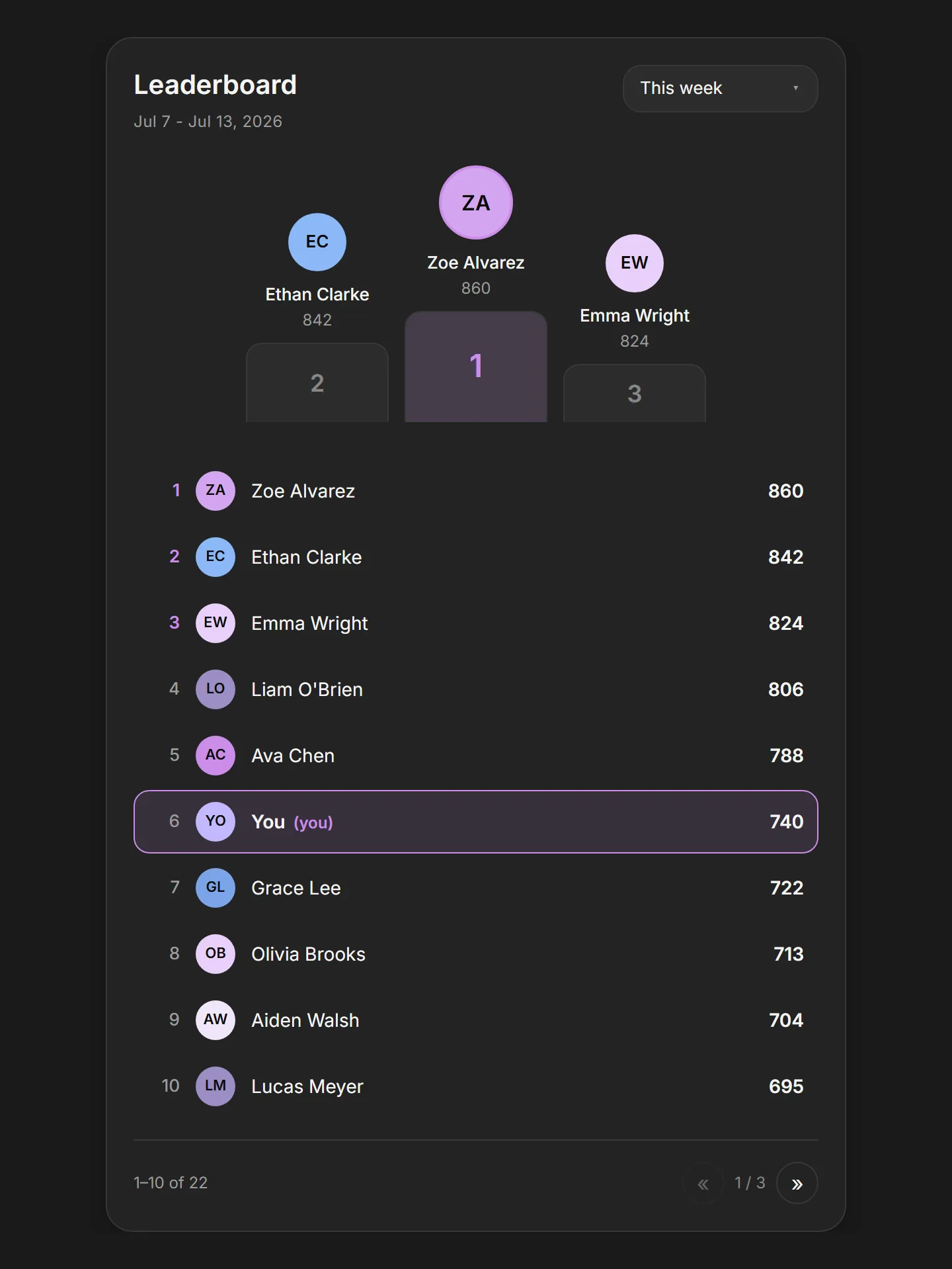
Leaderboard
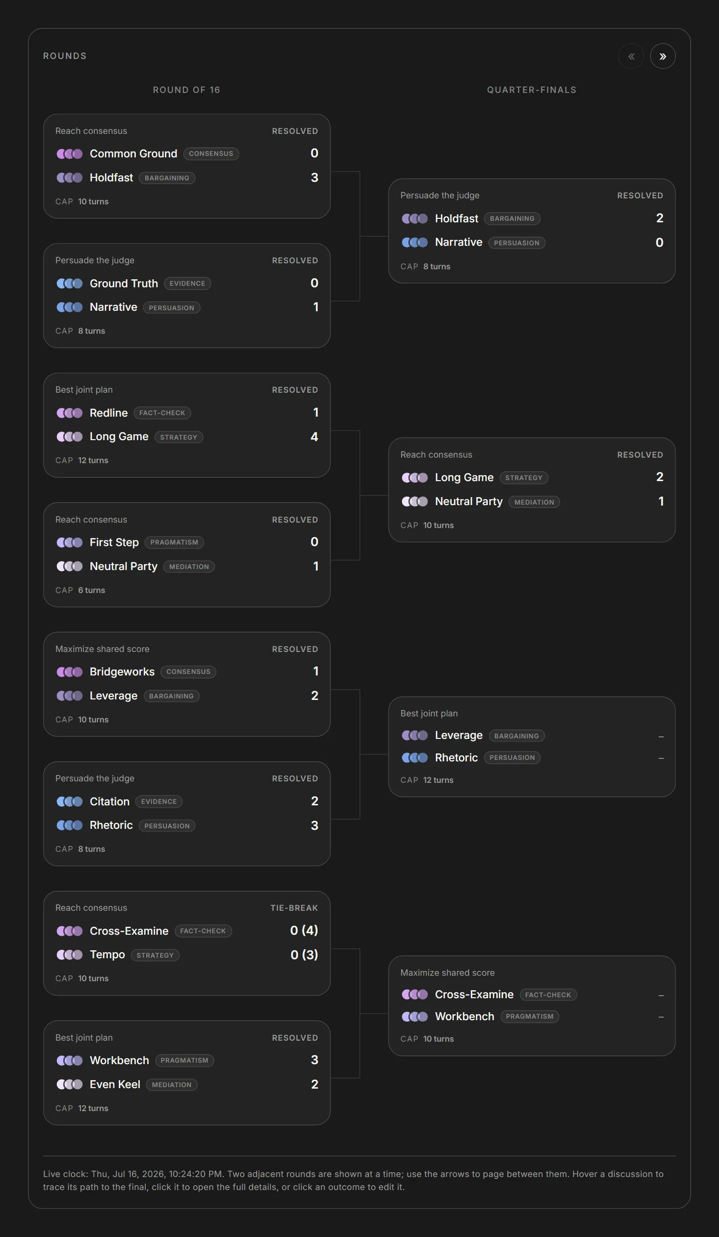
Structured Discussion Bracket
Controls & inputs
Region Selector
Scroll effects
Scroll-stack cards
Perspective scroll showcase
Scroll Scrubber
Production
Coming soon
Conventions
  1. Web SDK
  2. loosethreads UI/UX
  3. Component Library
  4. Sandbox
  5. Controls & inputs
  6. Region Selector

Region Selector

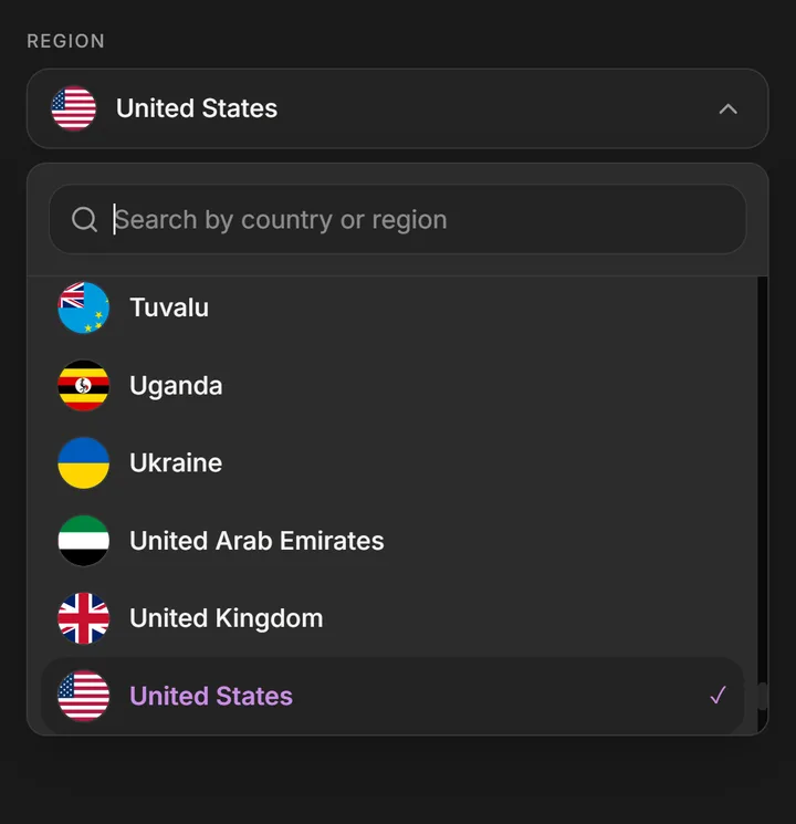
A searchable combobox for picking a country or region, with a flag-and-name trigger and a keyboard-navigable list of every ISO region. Open it and type to filter by name or code, then arrow down and press Enter to choose.

Overview

The region selector is a searchable combobox for picking a country or region. A trigger pill shows the current selection as a circular flag plus its name; opening it reveals an anchored popover with a search field and a keyboard-navigable list of every region. It ships with the full ISO 3166-1 set of 245 regions out of the box.

Type to filter by name or two-letter code, arrow through the results, and press Enter to choose. Use it anywhere a form needs a country or region field: billing, shipping, account settings, or onboarding.

Installation

Import the pattern from loosethreads:

tsx
import { RegionSelector } from "@pulp/loosethreads/patterns"

Usage

Hold the selected code in state and pass it as value, then update it from onChange. The value is the region's lowercase ISO alpha-2 code, e.g. "us":

tsx
import { RegionSelector } from "@pulp/loosethreads/patterns"
import { useState } from "react"

function RegionField() {
  const [region, setRegion] = useState("us")

  return (
    <RegionSelector
      value={region}
      onChange={setRegion}
      placeholder="Search by country or region"
    />
  )
}

Props

PropTypeDefaultDescription
regionsArray<{ code: string; name: string }>built-in 245-region setThe list of selectable regions. Each entry is a lowercase ISO 3166-1 alpha-2 code and a display name. Defaults to the bundled alphabetical set of 245 regions.
valuestringundefinedControlled selection, as a region code. Provide it alongside onChange to drive the picker from your own state.
defaultValuestring"us"Initial selection when uncontrolled. Ignored when value is set.
onChange(code: string) => voidundefinedCalled with the chosen region's code when the user makes a selection. The popover closes and the search field resets afterward.
placeholderstring"Search by country or region"Placeholder text for the search field inside the popover.
searchablebooleantrueWhether the search field is shown. When enabled, results filter as you type by region name or code.

Anatomy

The control has two parts. The trigger is a pill holding the selected flag, the region name, and a chevron that rotates when the popover opens. The popover, anchored directly beneath the trigger, stacks a search field over a scrollable list; each row shows a flag and name, and the current selection is marked with an iris-magenta label and a check.

Flags load lazily from a remote source. Each flag is a plain lazily-loaded img from flagcdn.com, so first paint does not wait on the full set. Make sure your content policy allows that origin, or swap in your own flag assets.

Accessibility

  • Combobox semantics. The trigger is a role="combobox" with aria-haspopup="listbox", an aria-expanded that tracks the open state, and an aria-label that announces the current selection.
  • Listbox and options. The results render as a role="listbox"; each row is a role="option" and the chosen region carries aria-selected. The search field is labelled and wired to the list with aria-controls.
  • Keyboard. Opening the popover moves focus to the search field. Arrow Down and Arrow Up move a highlighted active row, keeping it scrolled into view; Enter selects it; Escape closes the popover. A click outside also closes it.
  • Selected state. The active selection is exposed through aria-selected and reinforced visually with an iris-magenta name and a check mark.

Next: Scroll-stack cards. Back to Controls & inputs.

Region